
Inspired by a tweet from Laravel employee #1, Mohamed Said, I decided to write this post detailing how to resolve issues that developers might run into when using Tailwind CSS. Most of the problems can be solved pretty easily, you just need to know a couple of classes to use in the right spots.
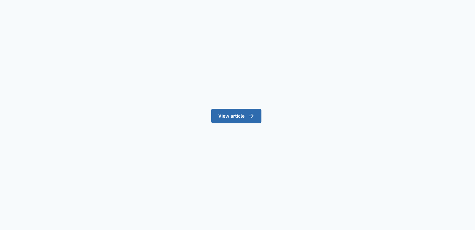
How to center an SVG and text inside a button or link with Tailwind CSS
To vertically center an icon and some text inside a button or link, add the following classes to the button/link inline-flex items-center. Note: wrapping the text in a span is not required, but I like to for consistency.
Example screenshot
Code
<button class="inline-flex items-center px-6 py-3 text-white font-semibold bg-blue-700 rounded-md shadow-sm"> <span>View article</span> <svg class="ml-3 w-5 h-5" fill="currentColor" viewBox="0 0 20 20"> <path fill-rule="evenodd" d="M10.293 3.293a1 1 0 011.414 0l6 6a1 1 0 010 1.414l-6 6a1 1 0 01-1.414-1.414L14.586 11H3a1 1 0 110-2h11.586l-4.293-4.293a1 1 0 010-1.414z" clip-rule="evenodd" ></path> </svg></button>How to vertically center a div inside another div with Tailwind CSS
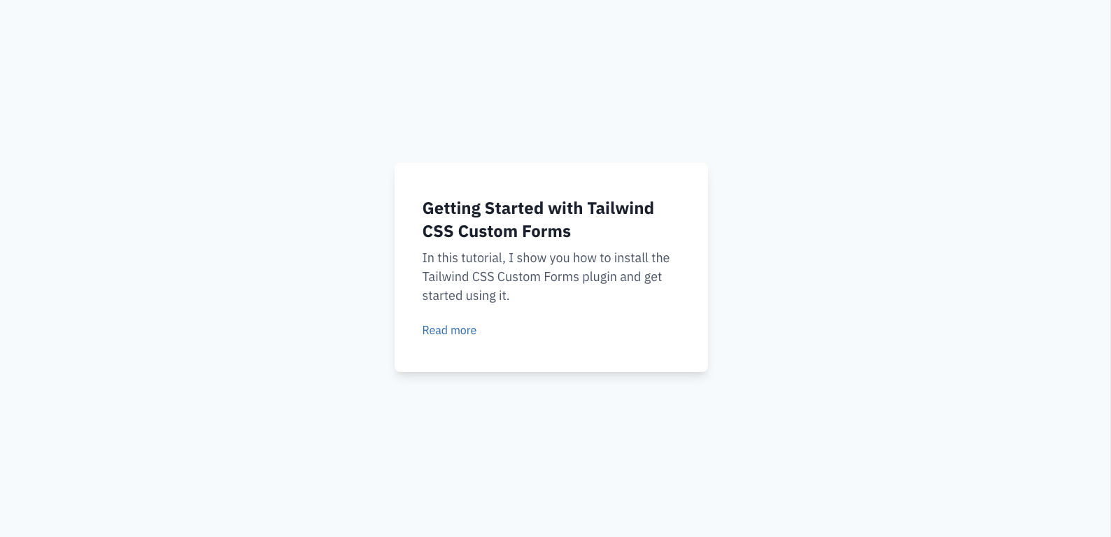
Vertically centering a div inside another div is a similar problem to the previous example. It’s very common to need to center a card or some other content vertically within a section on a page. To do so, add the flex items-center classes to the wrapper div. If the inner contents should also be horizontally centered, add the justify-center class as well.
Example screenshot
Code
<!-- Wrapper div with a height greater than the contents --><div class="min-h-screen flex items-center justify-center bg-gray-100"> <!-- Card or contents that should be centered vertically --> <div class="max-w-md px-10 py-12 bg-white rounded-lg shadow-lg"> <h2 class="text-gray-900 text-2xl font-bold leading-snug"> Getting Started with Tailwind CSS Custom Forms </h2> <p class="mt-2 text-lg"> In this tutorial, I show you how to install the Tailwind CSS Custom Forms plugin and get started using it. </p> <a href="#" class="mt-6 inline-block text-blue-700">Read more</a> </div></div>How to create a Bootstrap-like responsive column grid with Tailwind CSS and flexbox
One tricky thing that’s included in Bootstrap but “missing” from Tailwind is a responsive column/grid system built with flexbox. Note: I’m not talking about CSS Grid here.
The trick is using flex, flex-wrap, and negative margins to achieve the responsive columns.
Start with a “container” element that has some padding and a max-width/mx-auto if desired. The padding used here should be exactly half of the column “gap” you desire. In the example below, I’m using px-4.
Next, add your “grid wrapper”. It should have a negative margin and the flex flex-wrap classes. The negative margin should match the same amount as the padding on the container, so below I’m using -mx-4. If the negative margin is greater than the padding on the container, you might get horizontal scroll bars on some screen sizes which isn’t desirable. This is sort of the equivalent of the row class in Bootstrap.
Next, you can build your “columns”. Here, you’ll want to add the same amount of padding that was “subtracted” by the negative margin, so I’m using p-4 below. Here, you’ll also set your column widths. Instead of classes like col-4 col-md-3 used in Bootstrap, we’ll simply use the built in Tailwind width classes. Below, I’m using w-full sm:w-1/2 lg:w-1/3 to make the columns full-width on mobile, half-width on small screens, and one-third-width on large screens.
Inside each “column”, you can add whatever contents you desire. Below, I’ve added some cards as my content.
Now, you should have a functioning, responsive grid system. If you want to increase the amount of space between each grid column, increase the padding on the “container”, the negative margin on the “grid wrapper”, and the padding on each “grid column”.
Example screenshot
Code
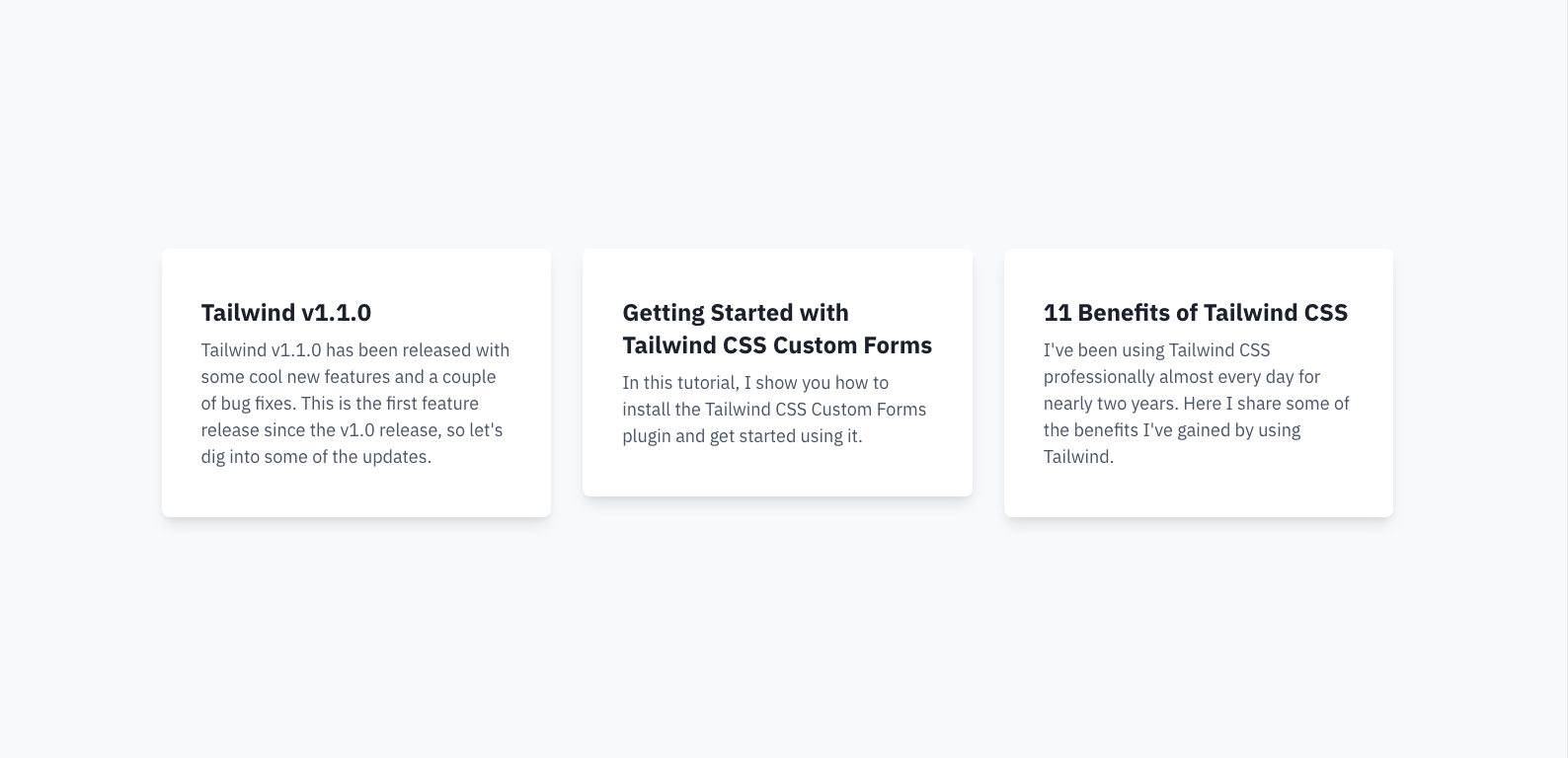
<!-- Container --><div class="max-w-screen-xl mx-auto px-4"> <!-- Grid wrapper --> <div class="-mx-4 flex flex-wrap"> <!-- Grid column --> <div class="w-full p-4 sm:w-1/2 lg:w-1/3"> <!-- Column contents --> <div class="px-10 py-12 bg-white rounded-lg shadow-lg"> <!-- Card contents --> </div> </div> <!-- Grid column --> <div class="w-full p-4 sm:w-1/2 lg:w-1/3"> <!-- Column contents --> <div class="px-10 py-12 bg-white rounded-lg shadow-lg"> <!-- Card contents --> </div> </div> <!-- Grid column --> <div class="w-full p-4 sm:w-1/2 lg:w-1/3"> <!-- Column contents --> <div class="px-10 py-12 bg-white rounded-lg shadow-lg"> <!-- Card contents --> </div> </div> </div></div>How to make all divs in a flex row equal height with Tailwind CSS
Expanding on the example above, you might’ve noticed the cards aren’t the same height. While in some cases that’s fine, in others, it’s more aesthetically pleasing for each item to be of equal height.
The trick is to add the flex flex-col classes to each “grid column” element and add the flex-1 class to each of the “grid column” elements contents.
Example screenshot
Code
<!-- Container --><div class="max-w-screen-xl mx-auto px-4"> <!-- Grid wrapper --> <div class="-mx-4 flex flex-wrap"> <!-- Grid column --> <div class="w-full flex flex-col p-4 sm:w-1/2 lg:w-1/3"> <!-- Column contents --> <div class="flex-1 px-10 py-12 bg-white rounded-lg shadow-lg"> <!-- Card contents --> </div> </div> <!-- Grid column --> <div class="w-full flex flex-col p-4 sm:w-1/2 lg:w-1/3"> <!-- Column contents --> <div class="flex-1 px-10 py-12 bg-white rounded-lg shadow-lg"> <!-- Card contents --> </div> </div> <!-- Grid column --> <div class="w-full flex flex-col p-4 sm:w-1/2 lg:w-1/3"> <!-- Column contents --> <div class="flex-1 px-10 py-12 bg-white rounded-lg shadow-lg"> <!-- Card contents --> </div> </div> </div></div>How to push a button to the bottom of every card in a row with Tailwind CSS
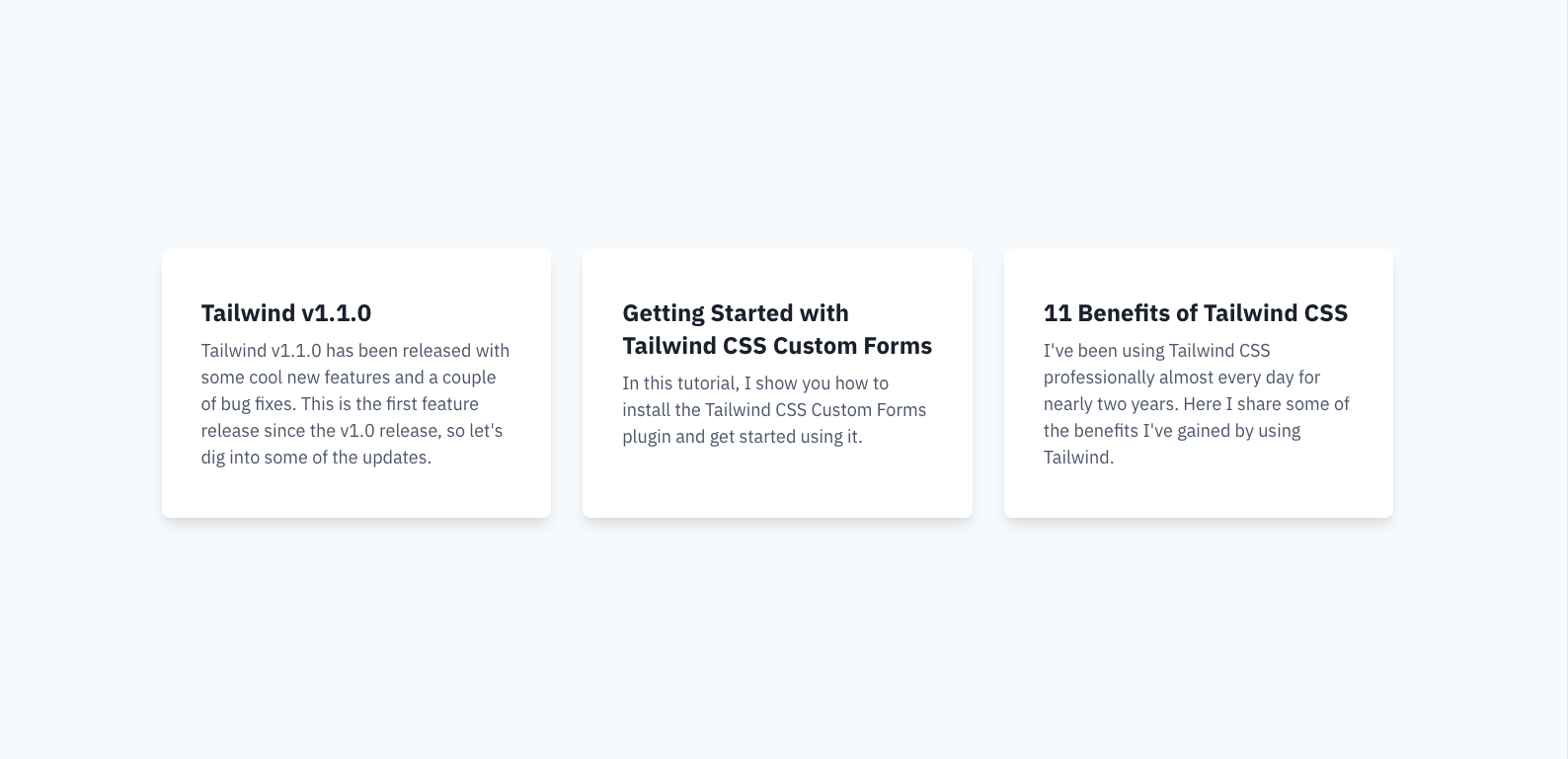
Expanding even further on the example above, if you were to have a button at the bottom of each card, you might want the button to be pinned to the bottom of each card.
Make sure you’ve implemented the previous tip then add flex flex-col to the “column contents” element. Wrap all the contents except the button in a div with the class flex-1 and the buttons should be pushed to the bottoms of the cards now.
Example screenshot
Code
<!-- Container --><div class="max-w-screen-xl mx-auto px-4"> <!-- Grid wrapper --> <div class="-mx-4 flex flex-wrap"> <!-- Grid column --> <div class="w-full flex flex-col p-4 sm:w-1/2 lg:w-1/3"> <!-- Column contents --> <div class="flex flex-col flex-1 px-10 py-12 bg-white rounded-lg shadow-lg" > <div class="flex-1"> <h2 class="text-gray-900 text-2xl font-bold leading-snug"> Tailwind v1.1.0 </h2> <p class="mt-2 text-lg"> Tailwind v1.1.0 has been released with some cool new features and a couple of bug fixes. This is the first feature release since the v1.0 release, so let's dig into some of the updates. </p> </div> <a href="#" class="mt-6 inline-flex items-center px-6 py-3 text-white font-semibold bg-blue-700 rounded-md shadow-sm" > View article </a> </div> </div> <!-- Grid column --> <div class="w-full flex flex-col p-4 sm:w-1/2 lg:w-1/3"> <!-- Column contents --> <div class="flex flex-col flex-1 px-10 py-12 bg-white rounded-lg shadow-lg" > <div class="flex-1"> <h2 class="text-gray-900 text-2xl font-bold leading-snug"> Getting Started with Tailwind CSS Custom Forms </h2> <p class="mt-2 text-lg"> In this tutorial, I show you how to install the Tailwind CSS Custom Forms plugin and get started using it. </p> </div> <a href="#" class="mt-6 inline-flex items-center px-6 py-3 text-white font-semibold bg-blue-700 rounded-md shadow-sm" > View article </a> </div> </div> <!-- Grid column --> <div class="w-full flex flex-col p-4 sm:w-1/2 lg:w-1/3"> <!-- Column contents --> <div class="flex flex-col flex-1 px-10 py-12 bg-white rounded-lg shadow-lg" > <div class="flex-1"> <h2 class="text-gray-900 text-2xl font-bold leading-snug"> 11 Benefits of Tailwind CSS </h2> <p class="mt-2 text-lg"> I've been using Tailwind CSS professionally almost every day for nearly two years. Here I share some of the benefits I've gained by using Tailwind. </p> </div> <a href="#" class="mt-6 inline-flex items-center px-6 py-3 text-white font-semibold bg-blue-700 rounded-md shadow-sm" > View article </a> </div> </div> </div></div>How to create a Bootstrap-like responsive column grid with Tailwind CSS and CSS grid
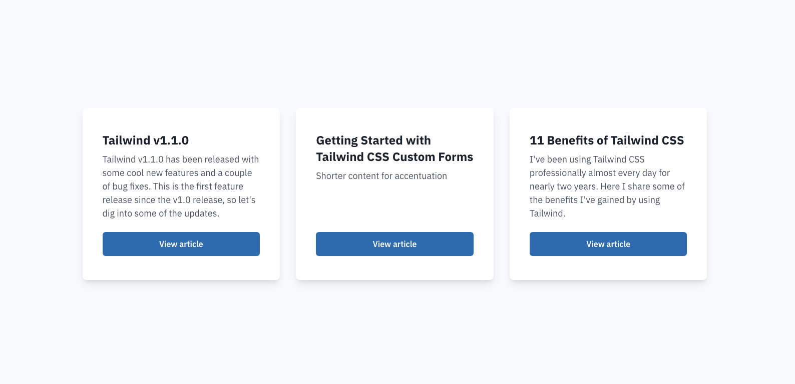
If your site doesn’t need to support IE11, you can use this much simpler implementation to achieve the same results as the previous example.
Just add grid grid-cols-1 gap-4 md:grid-cols-2 lg:grid-cols-3 to your “container”, and you can remove all the “wrappers” and insert your cards directly inside the “container”.
To adjust the gap between each column, replace the gap-4 class on the container with one of the other gap-* utilities Tailwind provides.
Code
<!-- Container --><div class="max-w-screen-xl mx-auto px-4 grid grid-cols-1 gap-4 md:grid-cols-2 lg:grid-cols-3"> <!-- Grid column --> <div class="flex flex-col flex-1 px-10 py-12 bg-white rounded-lg shadow-lg"> <div class="flex-1"> <h2 class="text-gray-900 text-2xl font-bold leading-snug"> Tailwind v1.1.0 </h2> <p class="mt-2 text-lg"> Tailwind v1.1.0 has been released with some cool new features and a couple of bug fixes. This is the first feature release since the v1.0 release, so let's dig into some of the updates. </p> </div> <a href="#" class="mt-6 inline-block px-6 py-3 text-center text-white font-semibold bg-blue-700 rounded-md shadow-sm" > View article </a> </div> <!-- Grid column --> <div class="flex flex-col flex-1 px-10 py-12 bg-white rounded-lg shadow-lg"> <div class="flex-1"> <h2 class="text-gray-900 text-2xl font-bold leading-snug"> Getting Started with Tailwind CSS Custom Forms </h2> <p class="mt-2 text-lg">Shorter content for accentuation</p> </div> <a href="#" class="mt-6 inline-block px-6 py-3 text-center text-white font-semibold bg-blue-700 rounded-md shadow-sm" > View article </a> </div> <!-- Grid column --> <div class="flex flex-col flex-1 px-10 py-12 bg-white rounded-lg shadow-lg"> <div class="flex-1"> <h2 class="text-gray-900 text-2xl font-bold leading-snug"> 11 Benefits of Tailwind CSS </h2> <p class="mt-2 text-lg"> I've been using Tailwind CSS professionally almost every day for nearly two years. Here I share some of the benefits I've gained by using Tailwind. </p> </div> <a href="#" class="mt-6 inline-block px-6 py-3 text-center text-white font-semibold bg-blue-700 rounded-md shadow-sm" > View article </a> </div></div>Conclusion
Hopefully you were able to find some problems you’ve ran into, and hopefully, my solutions help you solve them. If there are any other CSS problems you run into often, reach out and tell me on Twitter! I’ll try to come back to this post and add more problems and solutions as time goes on and I come across more.

TALL stack (Tailwind CSS, Alpine.js, Laravel, and Livewire) consultant and owner of roasted.dev.


