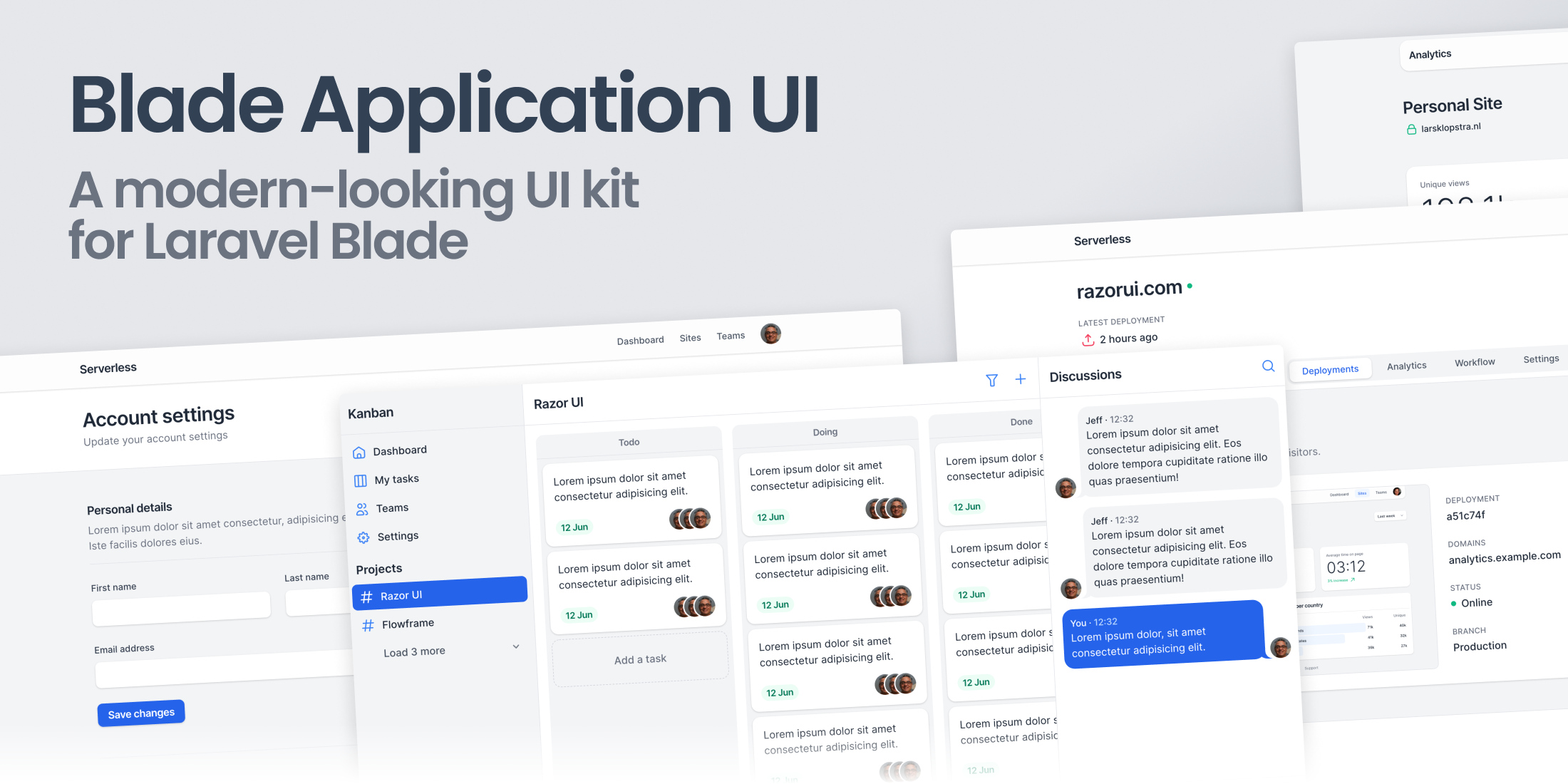
Designing a consistent component library is difficult, expensive, and takes a lot of time.
Our solution? Razor UI: a modern-looking UI kit for Laravel Blade.
Save precious time and money with interactive components and templates that you can drop right into your project.
UI kit for Tailwind CSS
The components come in two variants.
- HTML — previewable copy-paste HTML templates that use Tailwind CSS and Alpine.js
- Blade UI — a Laravel package that abstracts all the styling logic into customizable Blade components. Just use the semantic components in your layout, and have a fully designed app
Built for the TALL Stack
Even though Razor UI can be used by anyone who's using Tailwind CSS, Livewire developers will benefit the most from our UI kit.
Imagine if you had a complete design system with ready to use components powered by Blade, Tailwind CSS and Alpine.js.
You'd go from this:
<section class="py-24"> <div class="grid md:grid-cols-[2fr,3fr] gap-6 md:gap-12 mt-6"> <aside> <h2 class="text-xl font-semibold tracking-tight">Personal</h2> <p class="mt-1 text-gray-500"> Lorem ipsum, dolor sit amet consectetur adipisicing elit. Quibusdam ducimus enim. </p> </aside> <form class="block p-2 space-y-2 bg-white shadow rounded-xl" action="" > <div class="grid grid-cols-2 gap-6 px-4 py-4"> <div class="col-span-2 space-y-2 md:col-span-1"> <label class="inline-block text-sm font-medium text-gray-700" for="first_name" >First name</label> <input class="block w-full h-10 transition duration-75 border-gray-300 rounded-lg shadow-sm focus:ring-1 focus:ring-inset focus:ring-blue-600 focus:border-blue-600" id="first_name" type="text" > </div> <div class="col-span-2 space-y-2 md:col-span-1"> <label class="inline-block text-sm font-medium text-gray-700" for="last_name" >Last name</label> <input class="block w-full h-10 transition duration-75 border-gray-300 rounded-lg shadow-sm focus:ring-1 focus:ring-inset focus:ring-blue-600 focus:border-blue-600" id="last_name" type="text" > </div> <div class="col-span-2 space-y-2"> <label class="inline-block text-sm font-medium text-gray-700" for="email" >Email address</label> <input class="block w-full h-10 transition duration-75 border-gray-300 rounded-lg shadow-sm focus:ring-1 focus:ring-inset focus:ring-blue-600 focus:border-blue-600" id="email" type="email" > </div> <div class="col-span-2 space-y-2"> <label class="inline-block text-sm font-medium text-gray-700" for="about_me" >About me</label> <textarea class="block w-full transition duration-75 border-gray-300 rounded-lg shadow-sm focus:border-blue-600 focus:ring-1 focus:ring-inset focus:ring-blue-600" id="about_me" ></textarea> </div> </div> <div class="border-t"></div> <footer class="flex items-center justify-end px-4 py-2 space-x-4"> <button class="inline-flex items-center justify-center h-8 px-3 text-sm font-semibold tracking-tight text-white transition bg-blue-600 rounded-lg shadow hover:bg-blue-500 focus:bg-blue-700 focus:outline-none focus:ring-offset-2 focus:ring-offset-blue-700 focus:ring-2 focus:ring-white focus:ring-inset" type="submit" >Save details</button> </footer> </form> </div></section>To this:
<x-app-ui::form card> <x-slot name="heading"> Personal </x-slot> <x-slot name="description"> Lorem ipsum dolor sit amet consectetur adipisicing elit. </x-slot> <x-app-ui::input-group> <x-app-ui::input label="First name" name="first_name" /> <x-app-ui::input label="Last name" name="last_name" /> </x-app-ui::input-group> <x-app-ui::input label="Email address" type="email" name="email" /> <x-app-ui::textarea label="About me" name="about" /> <x-slot name="actions"> <x-app-ui::button type="submit" size="sm" > Save details </x-app-ui::button> </x-slot></x-app-ui::form>Huge improvement, right?
With Razor UI's re-usable Blade components you don't have to think about naming your own components, the API, and styling.
Simply pick components from our documented library and start building!
Pay once, own it forever
We think great UI components should be accessible to everyone. That's why we decided to go with lifetime licenses rather than monthly or yearly plans. In addition to that, we also offer parity pricing — which means that the packages will be priced according to your country's purchasing power.
So, when you purchase a package you'll own it forever and keep receiving updates at no cost!
The Blade UI package costs $59, and you can use the code LARAVELNEWS during checkout to save 15% on your order.