I have been a fan of Laravel Livewire since it was first released, and I have used it many times to create great user interfaces for applications. One of the things I find I do a lot is create extracted components that I can pass others into - so that I don't have 20 different modals or slide-overs, for example.
In this tutorial, I will walk through how you can create a slide-over component for your TALL Stack applications so you, too, can implement this approach.
I will assume that you have already installed Laravel and Livewire and have a basic application set up. I will use Tailwind UI and Tailwind CSS for the styling because I have no idea how to design anything.
Let's start by creating a generic component in Livewire called SidePanel, which will contain all the code and controls required to open and close the panel. Let's get building.
php artisan livewire:make SidePanel --testWe first need to have the state available so it can be either open or closed, which I am sure you will agree is a vital aspect of a side panel.
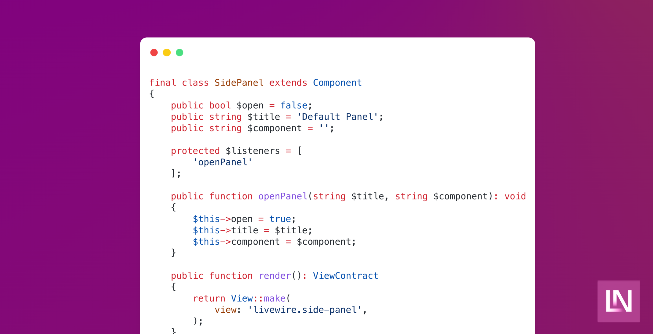
declare(strict_types=1); namespace App\Http\Livewire; use Illuminate\Contracts\View\View as ViewContract;use Illuminate\Support\Facades\View;use Livewire\Component; final class SidePanel extends Component{ public bool $open = false; public function render(): ViewContract { return View::make( view: 'livewire.side-panel', ); }}Here we have a standard Livewire component, customized to my very opinionated way. We have one property so far called open - which we will "entangle" on the front-end using AlpineJS. We need a couple of other properties to allow us to display the panel and not crash if a component is not passed.
declare(strict_types=1); namespace App\Http\Livewire; use Illuminate\Contracts\View\View as ViewContract;use Illuminate\Support\Facades\View;use Livewire\Component; final class SidePanel extends Component{ public bool $open = false; public string $title = 'Default Panel'; public string $component = ''; public function render(): ViewContract { return View::make( view: 'livewire.side-panel', ); }}We have a default title and a component property that allows us to choose what component is loaded. This way, other components talking to it can tell it what to load and pass a title to be displayed. Let's take a look at the template for this component:
<section x-data="{ open: @entangle('open') }" @keydown.window.escape="open = false" x-show="open" x-cloak class="relative z-10" aria-labelledby="slide-over-title" x-ref="dialog" aria-modal="true"> <div x-show="open" x-cloak x-transition:enter="ease-in-out duration-500" x-transition:enter-start="opacity-0" x-transition:enter-end="opacity-100" x-transition:leave="ease-in-out duration-500" x-transition:leave-start="opacity-100" x-transition:leave-end="opacity-0" class="fixed inset-0 bg-gray-500 bg-opacity-75 transition-opacity" ></div> <div class="fixed inset-0 overflow-hidden"> <div class="absolute inset-0 overflow-hidden"> <div class="pointer-events-none fixed inset-y-0 right-0 flex max-w-full pl-10"> <div x-show="open" x-cloak x-transition:enter="transform transition ease-in-out duration-500 sm:duration-700" x-transition:enter-start="translate-x-full" x-transition:enter-end="translate-x-0" x-transition:leave="transform transition ease-in-out duration-500 sm:duration-700" x-transition:leave-start="translate-x-0" x-transition:leave-end="translate-x-full" class="pointer-events-auto w-screen max-w-md" @click.away="open = false" > <div class="flex h-full flex-col overflow-y-scroll bg-white py-6 shadow-xl"> <header class="px-4 sm:px-6"> <div class="flex items-start justify-between"> <h2 class="text-lg font-medium text-gray-900" id="slide-over-title"> Panel title </h2> <div class="ml-3 flex h-7 items-center"> <button type="button" class="rounded-md bg-white text-gray-400 hover:text-gray-500 focus:outline-none focus:ring-2 focus:ring-indigo-500 focus:ring-offset-2" @click="open = false" > <span class="sr-only">Close panel</span> <svg class="h-6 w-6" xmlns="http://www.w3.org/2000/svg" fill="none" viewBox="0 0 24 24" stroke-width="1.5" stroke="currentColor" aria-hidden="true"> <path stroke-linecap="round" stroke-linejoin="round" d="M6 18L18 6M6 6l12 12"></path> </svg> </button> </div> </div> </header> <article class="relative mt-6 flex-1 px-4 sm:px-6"> @if ($component) @livewire($component) @else <div class="absolute inset-0 px-4 sm:px-6"> <div class="h-full border-2 border-dashed border-gray-200" aria-hidden="true"></div> </div> @endif </article> </div> </div> </div> </div> </div></section>Here we have quite a bit of markup to control how it looks and behaves, using @entangle to communicate between AlpineJS and Livewire. We check to see if component has been set and, if not, display an empty state. Next, we need to trigger this from other components - sending it some data so we can choose a component to load and a title to set. This will work from either Livewire or Alpine, but in my example, I will use another Livewire component to trigger opening the panel.
$this->emit('openPanel', 'New Title', 'component.name.with-namespace');We pass three parameters using the emit method. Firstly, the event name we are firing. Secondly, the title for the panel. Lastly, we want to pass the component itself as if we were loading it using the livewire directive in your view.
Now we need to ask our Side Panel component to listen for this event and have a method that will handle the logic of updating its properties.
declare(strict_types=1); namespace App\Http\Livewire; use Illuminate\Contracts\View\View as ViewContract;use Illuminate\Support\Facades\View;use Livewire\Component; final class SidePanel extends Component{ public bool $open = false; public string $title = 'Default Panel'; public string $component = ''; protected $listeners = [ 'openPanel' ]; public function openPanel(string $title, string $component): void { $this->open = true; $this->title = $title; $this->component = $component; } public function render(): ViewContract { return View::make( view: 'livewire.side-panel', ); }}With the listener accepting all of the required parameters and Alpine handling the open and closed state - we can close this panel and replace the shown component.
This approach has allowed me to create clean user interfaces that open a separate component as and when needed. Also, the component we pass through to the panel can still be used as an isolated component for a view.
How do you handle these use cases in your projects? How do you think this will change in Livewire v3? Let us know your thoughts on Twitter.


