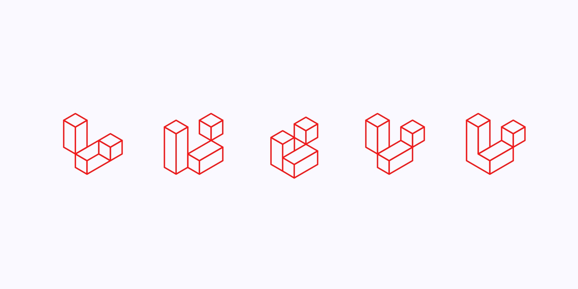
Focus Lab released a case study on the branding work behind the new Laravel logo and site design that launched with v6:
The creative exploration for the Laravel identity stemmed from the following key concepts: building blocks, perspective, multi-dimensional, and elegant.
From these concepts grew a system of three-dimensional building blocks, a modern evolution of the original perspective L mark that Laravel users had come to know and love. Our team then crafted a visual language comprised of modern 3D renders. This made for a more tangible approach when paired with the simplistic linework of the logomark. In addition, a vibrant secondary color palette was introduced to inject a sense of personality and fun while counterbalancing the primary red.
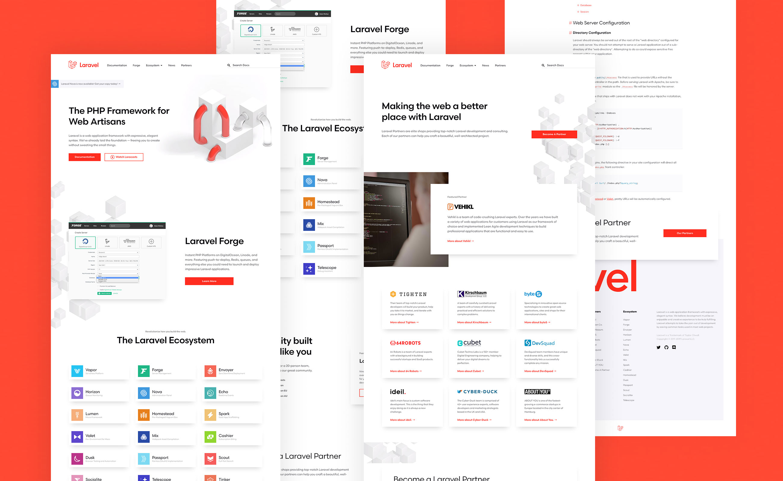
Visit Focus Lab’s site for more details on what went into the branding and be sure and check out the 3D animations of the logo they made.

