Tailwind CSS is a really great utility CSS framework. Form inputs are one of the harder parts of a web app to style using utility classes. By default, Tailwind resets any browser-specific styling, but the inputs are pretty ugly. Making inputs look really great usually means writing custom CSS including pseudo-selectors like ::after and even custom SVGs inside your CSS.
Tailwind CSS Custom Forms is a plugin built to provide better default styling for form inputs and make it easier to customize them inside a project using Tailwind. The styling the plugin provides is compatible with all browsers down to IE11 and completely accessible due to really nice focus states.
In this tutorial, I’ll show you how to install the plugin and get started using it. It’s really easy to install and configure, so let’s get started!
Installation
To install the plugin, run npm install @tailwindcss/custom-forms --save-dev inside your project. After that, you need to require() the plugin inside your Tailwind config file.
// tailwind.config.jsmodule.exports = { // ... plugins: [ require('@tailwindcss/custom-forms'), ]}Lastly, re-compile your CSS to pick up the changes made by the plugin.
Using the plugin’s classes
The plugin provides really simple classes that you can use on each type of input. Some of the classes included are form-input, form-textarea, form-select, form-multiselect, form-checkbox, and form-radio. Add one of these to the respective input type, and instantly you’ll have better styling than the browser defaults.
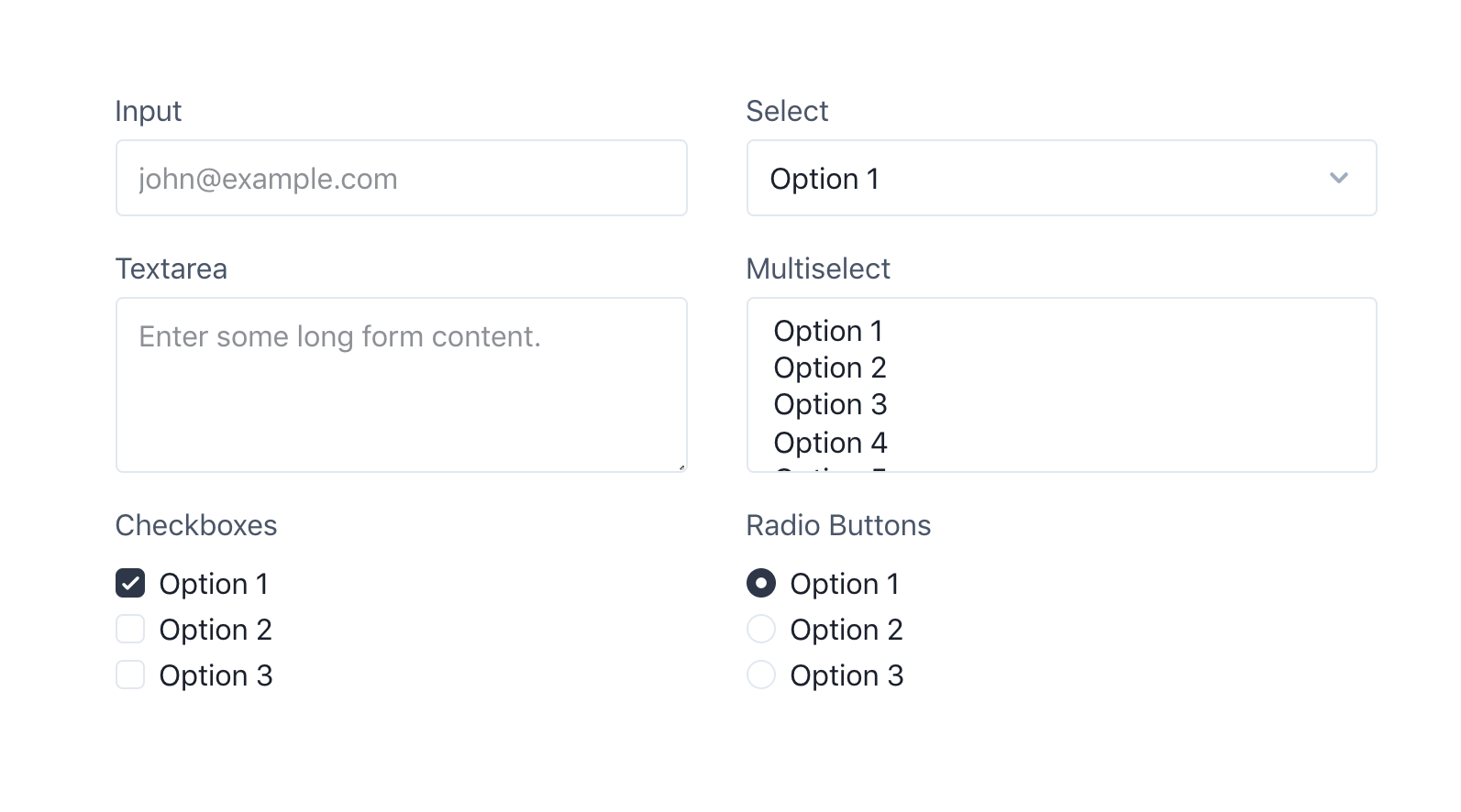
To customize the background colors on checkbox and radio inputs, add a regular Tailwind text-{color} class to the input specifying the color you’d like to be applied.
You can also customize the size of checkbox and radio inputs by adding h-{height} and w-{width} classes directly on the inputs. They use h-4 w-4 by default, but if you want your input to be slightly larger, try h-5 w-5.

Customizing the default values
Just like Tailwind, the Custom Forms plugin provides a really nice way to customize the defaults. Add a theme.customForms key to your Tailwind config file you can customize specific properties on each input type using a CSS-in-JS syntax:
// tailwind.config.jsmodule.exports = { theme: { customForms: theme => ({ default: { input: { borderRadius: theme('borderRadius.lg'), backgroundColor: theme('colors.gray.200'), '&:focus': { backgroundColor: theme('colors.white'), } }, select: { borderRadius: theme('borderRadius.lg'), boxShadow: theme('boxShadow.default'), }, checkbox: { width: theme('spacing.6'), height: theme('spacing.6'), }, }, }) },}To read more about using and customizing the plugin, read the plugin’s documentation.
Conclusion
The Tailwind Custom Forms plugin provides a way for you to quickly get started styling your form inputs. Whether you use the plugin to prototype a page or use it in production, I think it’s a great choice.
Check out the plugin’s demo page, documentation, and source code for more information.
TALL stack (Tailwind CSS, Alpine.js, Laravel, and Livewire) consultant and owner of designtotailwind.com.

