Dash UI is a Laravel Blade Component Library Inspired by Shopify Polaris
Published on by Paul Redmond
Dash UI is a component library for Laravel Blade inspired by Shopify Polaris. It was created with Tailwind CSS, Laravel Blade components, and Alpine.js and designed for ease of integration and customization.

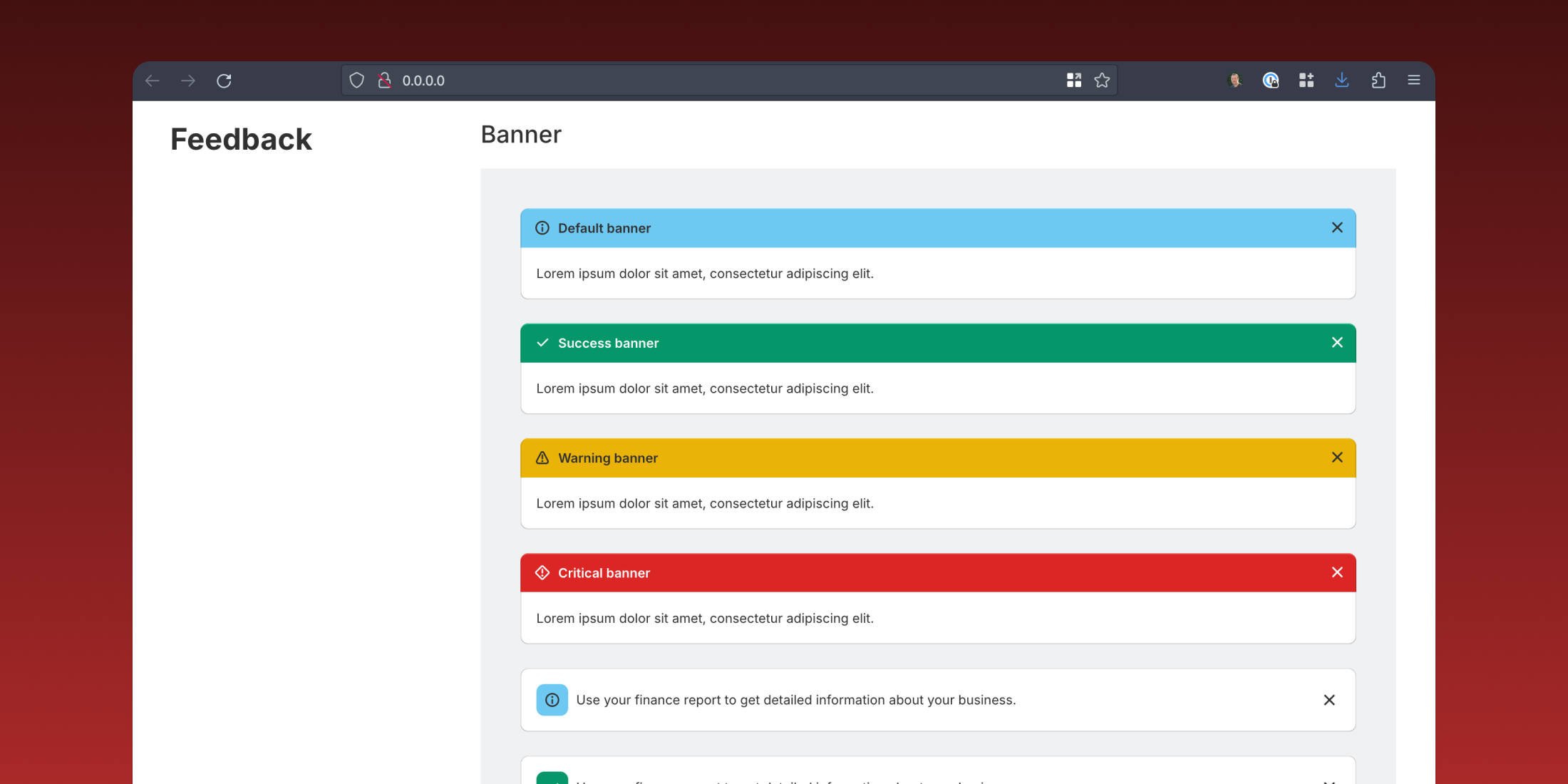
This UI kit includes a comprehensive set of UI elements that allow you to quickly start building your app and customizing it with Blade components. The kit consists of the following components:
- Buttons and Button Groups
- Avatars
- Thumbnails
- Badge
- Cards
- Empty State
- Form Input UI Elements
- Feedback banners
- Alert boxes
- Inline Errors
- Flash messages
- Circle loader
- Popover menu
- Tooltips
- Modal
- Copy to clipboard
- Navigation
- And more.
All components in DashUI are customizable by passing classes or using inline styles:
<x-dashui-button class="my-custom-class"> Click Me</x-dashui-button>To get started with this package, check out the project documentation. Also, check out the demo Laravel application if you'd like to see how to use these components.


